
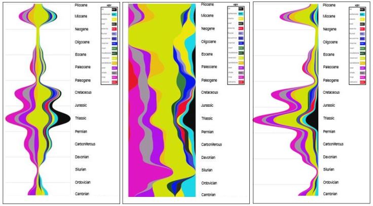
Figure 1 – Frequency of Geological Concept ‘Mentions’ in text Co-occurring with Petroleum Systems Elements by Geological Time. Streamgraph (stacked area chart) Sankey Curves; Three visualizations shown for the ssame data: Silhouette [left], expanded [centre], zero-offset [right]. Extraction from 40 public domain articles using Python/RawGraphs.
The ‘dark layers’ are associated to source rock, organic lithologies or anoxic environments. The ‘yellow/orange’ layers are associated to reservoirs, ‘purple layers’ are seals and traps, ‘red’ are volcanics. The ‘light blue’ is carbonate lithology, ‘darker blue’ is lacustrine, river and marine depositional environments. The key is shown in Figure 2.
 Figure 2 – Silhouette streamgraph and key. Source Rock (SR) in black can be clearly seen.
Streamgraphs can be an ’emotionally’ engaging and useful way to show the ebb and flow (hence river metaphor) for large amounts of topic changes over time. Stacked area charts have two main purposes, to show a trend of a specific categeory as well as trends of aggregated categories. Early work dates back to 1999 ThemeRiver with the ordering of the layers, baseline layers, scaling and colours the four key areas. Bryon and Wattenberg (2008) emphasize the criticality of ordering and colouring in streamgraphs.
Quotes from users of systems deploying Streamgraphs include “helps see big picture“, “quickly led me to investigate the topics that had unique or extreme temporal qualities” and how events could have triggered such peaks (Bradley et al 2013).
There are no known published examples applying the technique to geological text extractions by time. Figure 1 may be the first published example. This is interesting as the ‘layering’ effect over time has certain geological connotations. Figure 3 shows the typical horizontal display (by time).
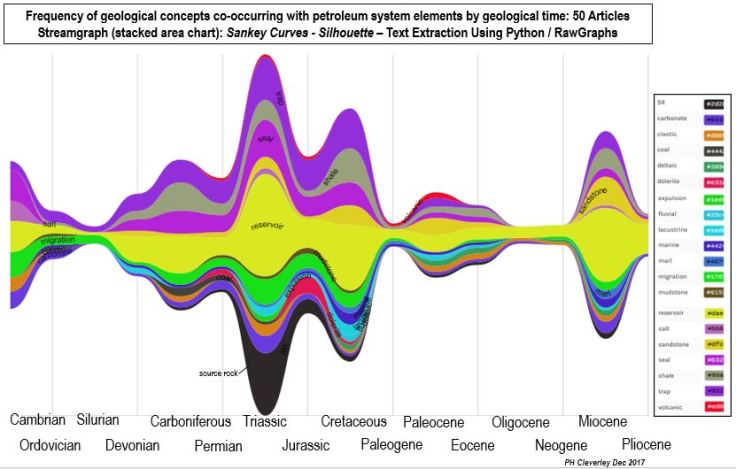
Figure 3 – Horizontal ‘Traditional’ Display
The expanded display forces each topic to be proportionally represented vertically (Figure 4). This can be misleading ‘horizontally’, but can surface some interesting trends that may otherwise remain hidden. For example, in Fig 4 we can see ‘marl’ in the Paleogene relatively ‘thicker’ (from a relative frequency perspective) to other concepts, although mention of source rocks for that time period is absent. That may warrant closer inspection and could lead to a new insight perhaps.
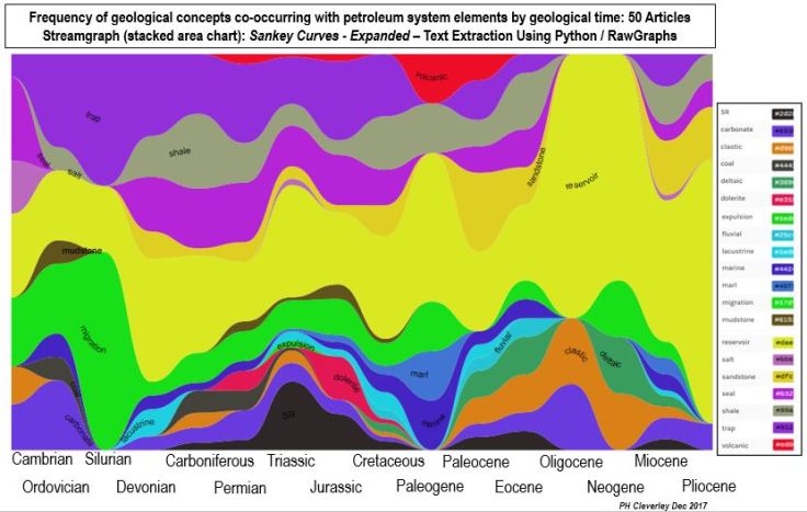
Figure 4 – Expanded display
There may be value in using these visualizations as an interactive interface. Allowing geoscientists to characterize a geological basin and drill down to the documents and sentences where the concepts co-occur. Due to the nature of these visualizations, they may resonate with geoscientists more so than other displays, to convey large amounts of data from text analytics and machine learned topics. This presents an area for further research.

Leave a comment