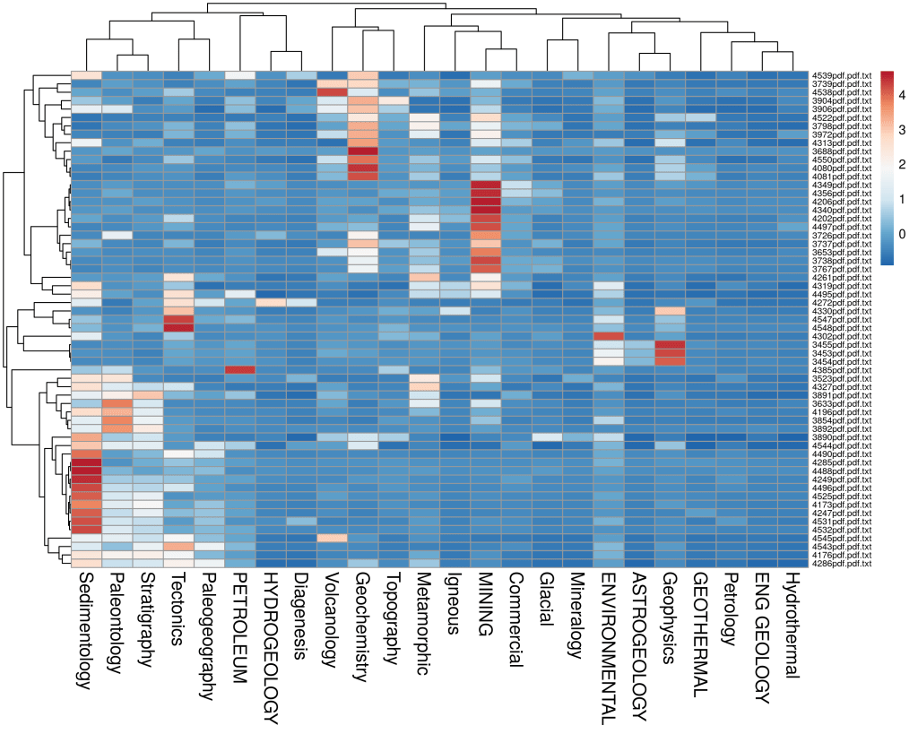
Example showing autoclassification output from GeoClassifier® from a selection of public domain geoscience documents. The proportion of topics are clustered in a Pearson dendrogram heatmap. Those above the mean are in red, below the mean in dark blue relative to the corpus/collection. Easy to see clusters of documents predominantly about certain topics and to spot ‘anomalies’ – which can be interesting to see and read further.
For more information see: http://www.infosciencetechnologies.com and also check out the OpportunityFinder® algorithm.

Leave a comment